Collector’s Gallery: Antique Chinese Vase

Q: I am interested in finding out more about this vase. Where is it from, the artist, and the value? The vase is 8 1/2 inches tall with 4-inch width. All sides are quite different, and it features a lot of gold. The elephant handles are cream colored with gold trim. The front and back […]

Collector’s Gallery: Circus Poster Trio

Ringling Bros and Barnum & Bailey Combined Shows circus poster with pouncing tiger

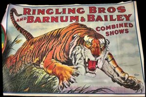
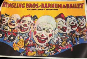
Q: My father bought these posters in the 1970s and never framed them. They are 23.5 inches by 36 inches. My mom wants to sell them. Can you tell me their worth and where we could sell them?

A: When trying to identify original circus posters from the many reproductions, there are several things to consider. There are certain key indicators of authenticity. My dad owned and operated a printing firm in Manhattan for many years, and I learned a great deal about printing as a kid. First, we can look at the printing and paper quality and look for signs of vintage printing techniques. Original circus posters were printed using lithography on thin paper and were often distributed folded, so you may see fold lines or creases. Reproductions are usually printed on heavier, glossier paper, which feels different to the touch compared to the lightweight, sometimes brittle stock used for vintage posters. Under magnification, original lithographic posters will not look pixelated, whereas modern digital reproductions may show pixelation or dot patterns.

Ringling Bros. and Barnum & Bailey Combined Shows poster with caricatures of 7 clowns, yellow background

Date tags and show information are another way to distinguish original posters. Original circus posters often had date tags or smaller papers pasted on them indicating the day, date, and location of the show. However, these tags are sometimes missing or partially torn off. Reproductions may have a copyright date, the word “reproduction,” or an order number (sometimes prefaced with “P”) printed in the lower corner. Occasionally, these markings may be trimmed off.

The posters should also be examined for signs of age. Original circus posters will show natural signs of aging, such as yellowing, minor creasing, and wear along the edges. Early-era posters were usually folded. An “original” poster without fold lines is likely a reproduction.

P.T. Barnum's Greatest Show On Earth & The Great London Circus poster with elephant with howdah and passengers

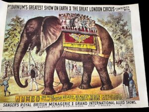
Lastly, and more importantly, in the case of your posters, we look at the size. Authentic vintage circus posters were typically printed in standard sheet sizes. The most common is the one-sheet, which measures 28 inches by 42 inches, and the half-sheet, which is 28 inches by 21 inches or 42 inches by 14 inches. Other sizes (multiples of sheets) were also used, but these two are the most prevalent.

Many reproductions are not printed in these standard sizes. For example, Ringling Bros. and Barnum & Bailey sold reproductions in sizes such as 24 inches by 17 inches or, as in the case of your posters, 23.5 inches by 36.25 inches.

While I am unable to examine your posters for printing technique or signs of age, I am fairly certain, based on their size, that they are late 20th-century reproductions with a value in the $20.00 to $30.00 range.


Our guest appraiser is Dr. Anthony Cavo, a certified appraiser of art and antiques and a contributing editor to Kovels Antique Trader. Cavo is also the author of Love Immortal: Antique Photographs and Stories of Dogs and Their People.

Do you have a question for Collector’s Gallery? Send your question and photos via e-mail to ATNews@aimmedia.com. Please include as much pertinent information about your item as possible, including size, condition, history and anything else that might help in identifying and valuing your item.

You May Also Like:

Collector Learns the Truth About Antique-Looking Artwork

Plaster relief of Pieta di San Pietro showing Mary cradling Jesus    Back side of a plaster relief of Pieta di San Pietro

Q: I wondered if you might have any information about this seemingly antique statue I’ve acquired. It depicts Christ and the Virgin Mary. The back is inscribed with the number “1796.” Thank you for your time and assistance.

A: Your statue is a stylized version of Michelangelo Buonarroti’s Pietà di San Pietro (1498–1499), which depicts the Virgin Mary cradling Jesus after his removal from the cross, representing her sixth sorrow. While Michelangelo created three distinct Pietàs—the Pietà di San Pietro, Pietà Bandini, and Pietà Rondanini—the Pietà di San Pietro remains the most iconic. The term pietà translates to pity in Italian. Your statue lacks information on dimensions or material composition but appears to be brown-stained plaster. Plaster was widely used in the 18th century for reproductions of classical sculptures, but your piece seems to be a poorly stained 20th-century copy, inscribed with a questionable date of “1796.” Based on its quality and apparent age, its value is estimated at $20–$25.

Our guest appraiser is Dr. Anthony Cavo, a certified appraiser of art and antiques and a contributing editor to Kovels Antique Trader. Cavo is also the author of Love Immortal: Antique Photographs and Stories of Dogs and Their People.


You May Also Like:

Villeroy & Boch: Looks Like a Fortune, Priced Like a Find

John Rogers Sculpture

Shrinking Statue


A Jelly Spoon Worth Its Weight in Silver

Whiting Silver Company jelly spoon with ornate relief and ivory handle

Q: This ornate spoon was purchased to expand a collection of unusual serving pieces. I believe this one is for poached eggs. It is 9 inches long. The bowl has a gold wash. I think the stem is horn. I’ve tried researching the hallmark, and I believe it is from Whiting Silver Co. I was wondering if this spoon could be attributed to Charles Osborne. If it is, how do I authenticate that, and how would that affect its value?

A: This is a sterling silver jelly spoon with an ivory handle, designed by Charles Osborne for the Whiting Silver Company. Osborne worked for Whiting from 1871 to 1878 and again from 1888 to 1915. Between 1879 and 1887, Osborne worked for Tiffany & Co. The griffn hallmark identifies it as being made by Whiting; it also bears the word “Sterling,” and a pattern number of “2888,” indicative of the “Ivory” pattern. There is no date code which establishes a date of production prior to 1905. Whiting used date codes between the years 1905 and 1924; your piece probably dates to around 1890.

Whiting produced approximately twenty-seven pieces in this line. Each piece was embellished with ornate fenestrations, repoussé decoration, and carved ivory handles. The ivory typically bears a brown tint at the proximal portion of the handle, which is reminiscent of the warm chocolate brown of well-aged meerschaum.

Your jelly spoon bears all the classic ornate designs of Osborne, particularly the fenestrated, repoussé embellishments along the shoulder, the tinted, carved ivory handle, and the gilt-washed bowl. It is worth noting that during the latter half of the 19th century, the use of ivory or “white gold” in flatware was highly prized and used by Whiting, Tiffany, and Gorham as well.

Your jelly spoon might sell in the $350.00 to $400.00 range, and that’s a lot of jelly.


Our guest appraiser is Dr. Anthony Cavo, a certified appraiser of art and antiques and a contributing editor to Kovels Antique Trader. Cavo is also the author of Love Immortal: Antique Photographs and Stories of Dogs and Their People.


You May Also Like:

Whiting Mark

Caring for Silver Flatware

Silver Flatware Serving Pieces

Antique Diptych Combines Compass and Sundial

A reader asks to learn more about a favorite lucky find that combines a compass and sundial. 

Pocket sundial/compass with lid open

Q: I have a wonderful old wooden compass/sundial box that I found on a thrift store auction. I don’t normally collect this type of object but I thought it was an interesting and beautiful piece. I think it is very old. It is German and measures 2.75” long, 1.75” wide and 1/2” deep. It is wood and appears to have its original screws, hooks and string. It also appears to have its original dial and dial glass. The graphics are relatively sharp and look like they may be hand colored. Could you tell me more about this cool little box? It’s one of my favorite objects that I have been lucky enough to find.

A: I’m glad you enjoy reading Kovels Antique Trader; it is gratifying for all of us here at the magazine to know. Your “wonderful old wooden compass/sundial box” appears to be from the late 18th century. It is a diptych sundial and compass.

The term “diptych” describes an object with two fl at plates or leaves that are often attached by a hinge. The upper leaf (vertical dial) displays hour markings, the lower leaf (horizontal dial) also displays hour markings and a compass. On the back of the vertical dial is a list of primarily European cities (except for New York) and their corresponding latitudes.

Back of a pocket sundial with list of cities and latitudes

Another component is the gnomon. On a sundial, it is the projecting piece that casts the shadow indicating the time. On a pocket or diptych sundial, it is the string. The sundial is placed on a flat surface with the compass needle pointing north, as sunlight crosses the string, the string casts a shadow across the time.

Many pocket sundials were made in Germany by David Beringer during the late 18th and early 19th century. However, there have been many reproductions of this instrument.

While a hands-on inspection is best to determine authenticity, I’d say that almost beyond a shadow of a doubt, yours appears to be genuine with perhaps a newer gnomon. If so, it could easily sell in the $700 to $1,000 range.

Our guest appraiser is DR. ANTHONY CAVO, a certified appraiser of art and antiques and a contributing editor to Kovels Antique Trader. Cavo is also the author of Love Immortal: Antique Photographs and Stories of Dogs and Their People.


You may also like:

Family Discovers Their Beautiful Norwegian Box Dates Back to 1844

Follow the Sun — But Fix Your Sundial

Daniel Boone’s Compass Sells at Auction

Villeroy & Boch: Looks Like a Fortune, Priced Like a Find

A Kovels Antique Trader reader asked, “Can you identify my vase from the photos?” Short answer? Yes, I can. It’s antique, stylish, and has classical charm—but it won’t fund your retirement. Here’s what you have and what it’s worth.


By Kele Johnson

Villeroy & Boch small Jasperware vase.


Your small vase appears to be a Villeroy & Boch Jasperware piece from the mid-to-late 19th century. The style is known for combining relief decorations and applied figures with a classical or mythical theme.

This vase has a cream-colored stoneware base and a classical Greek-style figure in a contrasting cream tone. It is reminiscent of the biscuit porcelain appliques of Parian-style ceramics, which imitate the look of marble. The applied leaves and other accents feature a platinum luster glaze designed to mimic the look of pewter or silver.

Villeroy & Boch is one of Europe’s oldest ceramic manufacturers, renowned for its fine porcelain and stoneware. It began in 1748 when François Boch and his sons started producing ceramics. In 1836, the company merged with the rival firm of Nicolas Villeroy to form Villeroy & Boch. Their Mettlach factory in Germany became famous in the 19th century for producing high-quality stoneware, including elaborately decorated steins, vases, and tableware. While they are often associated with Mettlach ware, not all their products fall under that category. Villeroy & Boch produced a wide range of relief-decorated ceramics, Jasperware-inspired pieces, and metal-accented stoneware throughout the Victorian and Art Nouveau periods. They have remained in business for over 275 years—an impressive feat.

Villeroy & Boch used an applied mark rather than incised mark.

Villeroy & Boch marks were often applied rather than incised, especially on stoneware and Mettlach pieces. The marks frequently appear in a raised, molded cartouche, part of the manufacturing process in which a separate piece of clay or slip was added before firing. This gives them a slightly dimensional, embossed look rather than the sharper, deeper effect of an incised mark.

This technique was common in 19th-century stoneware production, especially for companies like Villeroy & Boch, where molded decorations and relief work were key elements of their designs. The ceramic mark on the bottom of the base indicates a manufacturing period roughly between 1852 and 1872. A search of eBay, WorthPoint, and other auction sites shows this piece in good condition to be selling for between $65.00 and $100.00.


You may also like:

This Decoy’s Markings May Not Indicate Its True Origins

A reader looks for more information about his inherited duck decoy from Dr. Anthony Cavo.
Q: I’m looking to find more information on this duck decoy. My father left it to me when he passed.
A: Your decoy bears the name A.E. Crowel. But we caution you not to jump to any conclusions about the piece’s origins. A. Elmer Crowell (1862-1952) of East Harwich, Mass., was one of history’s greatest decoy makers and bird carvers. Crowell acquired his understanding of bird anatomy and plumage patterns during a lifetime observing and hunting Cape Cod’s abundant indigenous and migratory bird populations. As a master carver, Crowell’s work is in great demand by collectors and museums. Last year, one of his preening black duck decoys (c. 1905), featuring chip- and relief-carving on its crossed wings, sold for $480,000 at Guyette & Deeter Auctions.
Crowell’s early decoys were not stamped; to identify these works, you must be able to recognize his carving and painting techniques. In ensuing years, he used an oval burned-in stamp; an oval rubber stamp with a touch of modem advertising: “A.E. Crowell, Maker, High Class Decoys of every description, East Harwich, Mass.” (used on mantel birds); a paper label; and a rectangular steel stamp which indented the wooden base with: “AE. Crowell, Maker, East Harwich, Mass.” He did not mark some of his miniatures. On others, he penciled the species name on the base or signed it in ink: “AE. Crowell, Cape Cod.”
Crowell was a true artist and his work reflected that. It’s difficult to determine the quality of the decoy through your photographs, and the identification on the bottom of the decoy doesn’t correspond with what we know of Crowell’s marks. We encourage you to contact Guyette & Deeter or the Shelburne Museum in Shelburne, Vermont, for more help determining its origins.
Our guest appraiser is Dr. Anthony Cavo, a certified appraiser of art and antiques and a contributing editor to Kovels Antique Trader. Cavo is also the author of Love Immortal: Antique Photographs and Stories of Dogs and Their People.
You may also like:
Pristine Tonka Truck Retains its Nostalgic Wonder
Family Discovers Their Beautiful Norwegian Box Dates Back to 1844
Carving Out a Decoy Tradition

Pristine Tonka Truck Retains its Nostalgic Wonder

Q: Hi Dr. Cavo, I have had this Tonka dump truck since I was a youngster. I so enjoy it that we display it prominently in our dining room cabinet. Could you tell me anything about Tonka? While I doubt I would ever sell it, I am curious about its value. Thank you!
A: Okay, now we’re talking. I’m not sure what it is about trucks that speak to so many of us. Even if we’ve never driven one, countless numbers of us are drawn to these Mid-century steel wonders. Is it the shape, the color, the durable construction (Tonka trucks from this era were made from 20-gauge automotive steel), or the simple nostalgia they evoke?
The Mound Metalcraft company was founded in 1946 in Mound, Minnesota, and originally made garden tools. In 1955, they changed their name to Tonka Toys Inc. in honor of Lake Minnetonka. The words “Tanka” and “Tonka” are Dakota Sioux words meaning “Big” and “Great.” A variety of logos were used on their trucks. The red, blue, and yellow logo on your truck was used from 1947 to 1957 and was designed by a Mound, Minnesota, resident named Erling Eklof. The waves on your truck’s logo symbolize Lake Minnetonka, and the seagulls represent the company’s three founders: Lynn Baker, Avery Crounse, and Alvin Tesch.
In 1958, the seagulls were removed from the logo, and the colors changed to red, white, and grey. In 1963, the colors changed again to red and gold. In 1978, the oval logo was eliminated altogether, and the toys bore only the company name, “Tonka.” Hasbro acquired Tonka in 1991, and in 2001, Tonka Toys was inducted into the National Toy Hall of Fame.
I have seen these in poor condition sell for $150 or more. Your truck appears to be in pristine condition. Given the condition and the one-owner provenance, your truck could easily sell for $450 to $550. If, by chance, you had the original box, the price would be in the $650 to $700 range. However, if there is someone in your family who would cherish this truck, consider sending it their way when you’re ready.
Our guest appraiser is Dr. Anthony Cavo, a certified appraiser of art and antiques and a contributing editor to Kovels Antique Trader. Cavo is also the author of Love Immortal: Antique Photographs and Stories of Dogs and Their People.
Do you have a question for Collector’s Gallery? Send your questions and photos via e-mail to ATNews@aimmedia.com. Please include as much pertinent information about your item as possible, including size, condition, history, and anything else that might help identify and value your item.

Family Discovers Their Beautiful Norwegian Box Dates Back to 1844

Norwegian chest/box/casket 1888This decorative Norwegian folk art box is known as a “skrin.

Q: This is a Norwegian box we have had in our family for a long time. All we really know is a story about my great-great-grandmother, who had her baby clothes in it when she emigrated from Norway with her family. Her maiden name was Lillesand; there is a town in Norway by that name. When she emigrated, she did not speak English, so perhaps the immigration agent just gave them that last name because that was the town they were from. The initials on the chest are unknown also. They could be HMDH 1844 or AMDA 1844The box is 13 1/2 inches long, 8 inches wide, and 6 1/2 inches tall. The top of the bow, which extends over the body of the box, measures 14 inches long. Can you provide us with any information about this family keepsake? Thank you! 

A: I opened this email and just smiled. I have a weakness for wooden boxes and chests. This box, however, pushes all my box buttons. This box is a skrin, which in Norwegian translates to “casket,” but not in the modern sense of the word. The word “casket” was originally used to describe a decorative box, smaller than a chest, used for important documents. According to the Oxford English Dictionary, a casket, in early America, was a box for jewels.   

Norwegian chest/box/casket 1888 interior

This skrin is representative of classic Norwegian folk art typical of the Viksdalen region of Norway. Regarding the initials, I’m fairly certain they are not “HMD.” I believe they are “AMD” for the following reasons: the top of the first letter is closed – not something you would see in the letter “H” but more so because we see the date as “A 1844” where the “A” could stand for “anno,” which in Latin means “in the year” or the “A” could stand for “år,” which in Norwegian means “year.” 

The hinges are secured by rivets, which may cause confusion because we tend to think of rivets as a modern fastening method. Rivets have been used for thousands of years, especially in the Western world after 1830. The case, or body of the box, reveals wonderful hand-forged nails and dovetail construction. The dovetails have thin pins, which we see in cased pieces made before the mid-19th century; the scribe line is still visible. The decoration is in exceptional condition for a piece this age.  

1888 Norwegian box with hinges

Considering the beautiful hand-painted decorations, the construction, and the family provenance, I would value it in the $900 to $1,200 range and possibly more at a well-advertised, well-attended auction. 

As an aside, the name Lillesand is not used as a surname in Norway. Many, not all, Norwegian names have a patronymic origin and end in “sen/son” or “datter/dotter,” as in son or daughter. Hence, the name Hansen means son of Hans and Karlsdotter, the daughter of Karl. Almost all sources say that name changes by immigration officials are a myth. However, many years ago, I had a neighbor who emigrated to the U.S. from Italy. His surname was Pharoh. When I asked, he told me his actual family name was Ferro, but it was written as Pharoh at Ellis Island.

So much for myths. 

Our guest appraiser is Dr. Anthony Cavo, a certified appraiser of art and antiques and a contributing editor to Kovels Antique Trader. Cavo is also the author of Love Immortal: Antique Photographs and Stories of Dogs and Their People.

Collector’s Gallery: Mark Comes with a Mob Connection

By Elizabeth Burroughs-Heineman
AA Vantine Mark
A reader uncovers a porcelain mark tied to A. A. Vantine Co., once owned by mobster Arnold Rothstein—aka ‘The Brain’ and ‘The Fixer’—the inspiration for Gatsby himself. It turns out identifying porcelain marks is easier than fixing the World Series, but not by much!
Q: Could you please help me identify this mark? I’ve searched online but have had no luck. Thank you.
A: This mark was used by A.A. Vantine & Co., an import company that was in business in New York from about 1869 to 1951. They specialized in Asian imports, which is why the mark features the flags of Japan and Imperial (before 1911) China underneath the Turkish star and crescent. We haven’t found a specific date for this mark, but we have seen approximations of about 1910 to 1920.
When Japan opened to trade with the U.S. in 1853, it started a fashion for Japanese products in America. Ashley Abraham Vantine was one of many traders whose companies imported Japanese goods. He opened a shop in New York in the 1860s and had offices in Japan. The company also sold Chinese goods and gradually expanded to a general “Oriental” scope, selling Turkish, Russian, Indian, and Middle Eastern products as well.
By about 1916, Vantine’s New York location was called “The Oriental Store.” Most of the products were clothing, accessories, and home decorations. Elbert Hubbard, the founder of Roycroft, was a fan and praised the store in his magazine, The Philistine. Today, porcelain pieces from A.A. Vantine sell for about $30 to $50.
Arnold RothsteinArnold Rothstein
One of the most memorable aspects of A.A. Vantine & Co. is a brief time, 1926 to 1928, when it was owned by mobster Arnold Rothstein, also known as “The Brain” and “The Fixer,” an inspiration for the title character of F. Scott Fitzgerald’s The Great Gatsby. He is rumored to have been one of the conspirators who threw the 1919 World Series. He grew his wealth and influence by selling alcohol during Prohibition.
Seeing the potential in illegal drug sales, he bought Vantines in 1926 as a front for smuggling. The company was a familiar, well-established one, so customs officials did not thoroughly search their shipments. This came to an end when he was killed in 1928, possibly over a gambling debt. What happened to Vantines after that is not certain, but the company was closed by 1951.
You may also like:
Spatterware vs. Spongeware
Lovely Mystery Tray Identified
Decoding Spode: Spode Mark Explained

Skip to toolbar